Campus Human Resources Website
In conjunction with their IT Systems Optimization (HRITSO) program, CHR sought to update their website and reached out to other campus departments for design support.
The Audit
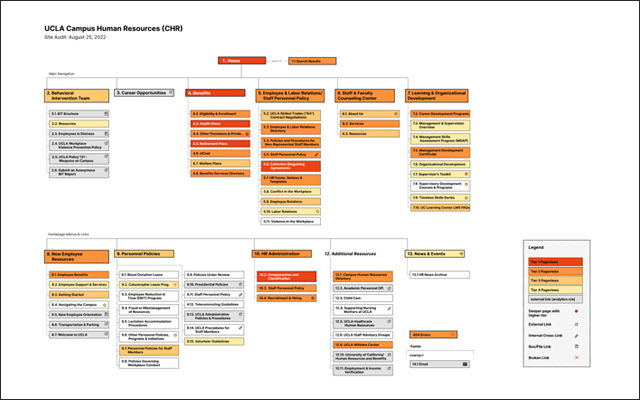
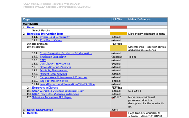
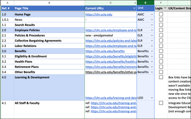
My work on the CHR Website started with an audit of the current site. As part of the audit, I reviewed analytics for the site, the current navigation structure, and every page I could find through manual browse, analytics, and a site crawler. The two core deliverables for this phase was a site map and a content table – both with analytics data.
In looking at the site I found issues common at UCLA and symptomatic of sites without structural design or guidance, that have been added to by different people in different ways and duct-taped together based on what the CMS (or various CMS’s over time) would allow. Stakeholders knew they needed a drastic refresh, and some units had ideas for what they wanted. But not all did, and there wasn’t a clear idea of how it should all come together.
Among the issues were…
- Section overview pages and many internal pages were lists of links, sometimes the same links repeated throughout the site. This resulted in a cognitively-intensive amount of information to scan and process. Each link could lead to another list of links on the destination page, requiring time-intensive click flows to find the desired information. It not only lacked appealing visuals or layouts, but accessible language.
- The heavy use of jargon, acronyms, policy numbers, internal procedures and governance-style language also made the site hard to process.
- Navigation was inconsistent with menu items in various places, not all of them ever-present. These led to different systems of subnavigation without clear or consistent wayfinding tools.
- There wasn’t a clear logic of where to put new or revised information or how to find and take down old information. Much was posted in “News”, leading to inconsistencies or gaps in core website sections.
- CHR is just one among many sites, tools and departments that offer HR-related services and information. This is not always known or expected by employees who are not always clear on who does what.
In short, it had to be organized. There was not a lot of new content needed. It just needed to be re-configured into flows that were logical from the users’ perspective.
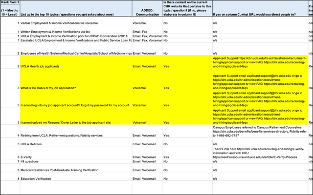
User Data
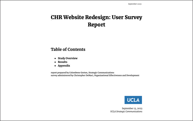
There were some pretty clear problems, but I also sought to get feedback from users. This was to make sure I was on the right track with the findings and the premise behind the redesign, but I also wanted to be sure we understood what they valued the most and were having the most challenges with. The primary ways we got input from users was first-hand through a survey and indirectly through stakeholder reports on top questions they get asked about. There were also general usage insights that could be gleaned from analytics.
Redesigning Content First
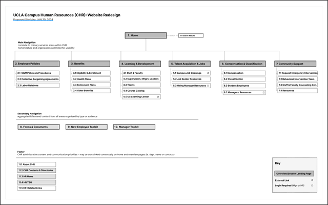
Content, not functionality or look and feel, is at the core of many websites at UCLA. The structure and organization of that content on each website or channel and across channels is the space where usability strategy is needed. The next step in figuring out how to organize the content was meeting with unit subject matter experts (SMEs) to understand their work in detail. We’d go back and forth to ensure the new system kept the integrity of the material while being compatible with modern use patterns and expectations. New structures were recorded in a new site map and a content outline – deliverables similar to those I started with for the audit. These become the core of the redesign. Putting content at the center also makes it more flexible given the constraints of the Drupal and the development plan. Capacity, tight resources, and maintenance process also must be considered to set the project up for success that endures past launch.
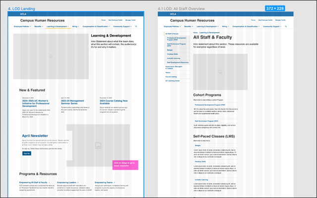
Once the content is outlined, the pages are mocked up in high resolution for various screen sizes using the UCLA Design System (which I’ve worked on with the Strategic Communication digital team). This is where the redesign starts to feel real and starts to come alive for the team, building anticipation for launch. After this point, it moves into other phases of production including development, final copy, and photo selects.
The website redesign is still in progress, but has benefitted from unique support, enthusiasm and collaboration. Upon a successful launch, the intention is to inform similar projects moving forward and level-up UCLA’s digital communication process and outcomes.